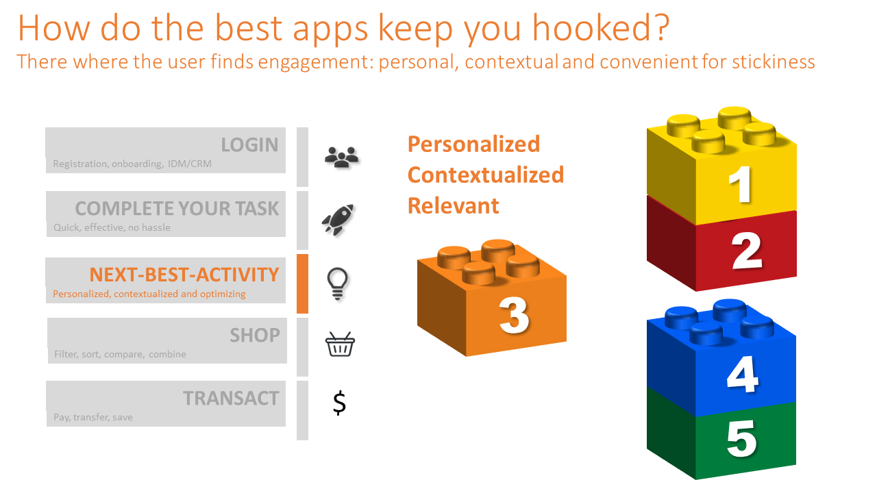
As our core business matures we inevitably reach for domains where we have ‘an unfair advantage’. By leveraging our own business operations, scale and solid customer engagement we can penetrate adjacent verticals and expand use cases. This way phone companies offer cloud storage, banks offer insurance and taxi services expand to food deliveries.
This does not always benefit the user experience with your Brand. Inconsistencies in user experience caused by rapid growth and make-shift reuse of existing capabilities often harms the core business. Apps become cumbersome to use as complexity increases and a single view of the customer is not always guaranteed.
So why does this happen?
We tend to build our digital products as a logical sequence of user-experience steps:
- you register or login
- you shop around or conduct your task-at-hand
- you choose a product and fill a shopping basket
- the app offers cross- and upselling
- you check-out (pay)
- you follow your order until it reaches you (status updates)
- you review your purchase with a ‘thumbs up’ and collect your loyalty points
So far so good, but as our business grows, so does the complexity of use cases and product types. Your once so clear-cut digital interface becomes cluttered with menu options and varying business logic.
Most apps ‘accept the fact’ and celebrate the complexity as a showcase of their wide product-offering. This is a common reflex but induces enormous complexity over time. Not only for your digital real-estate, but also for your users who will inevitably suffer from an inconsistent user-experience (UX) between journeys
Some applications break up in dedicated apps for specific journeys, which improves the usability, but introduces new challenges in development of a diverse portfolio of digital channels. The member apps stop ‘talking to each other’ and seamless switching between journeys becomes cumbersome for the user. Multiple logins, loss of data, replicating journey steps are some of the drawbacks of the journey specific apps.
Hypothesis
If we could develop individual capabilities on their own roadmap, we can keep their function and UX consistent across the entire Brand experience, without compromising on agility, unified UX and cutting edge features.
Let’s revisit the user journey described in the introduction.
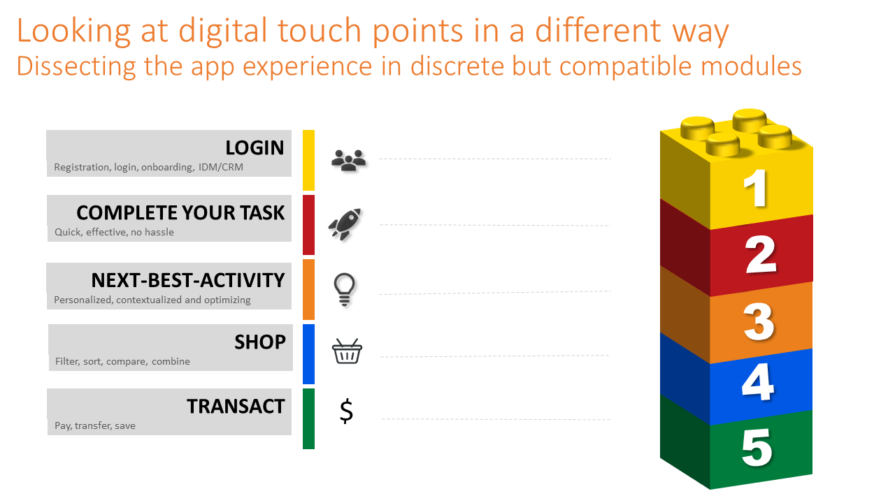
From a functional perspective, what would these capabilities be?
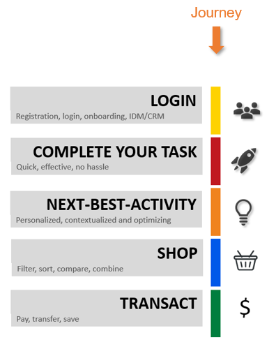

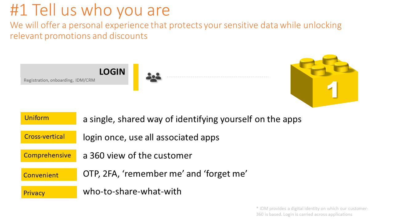
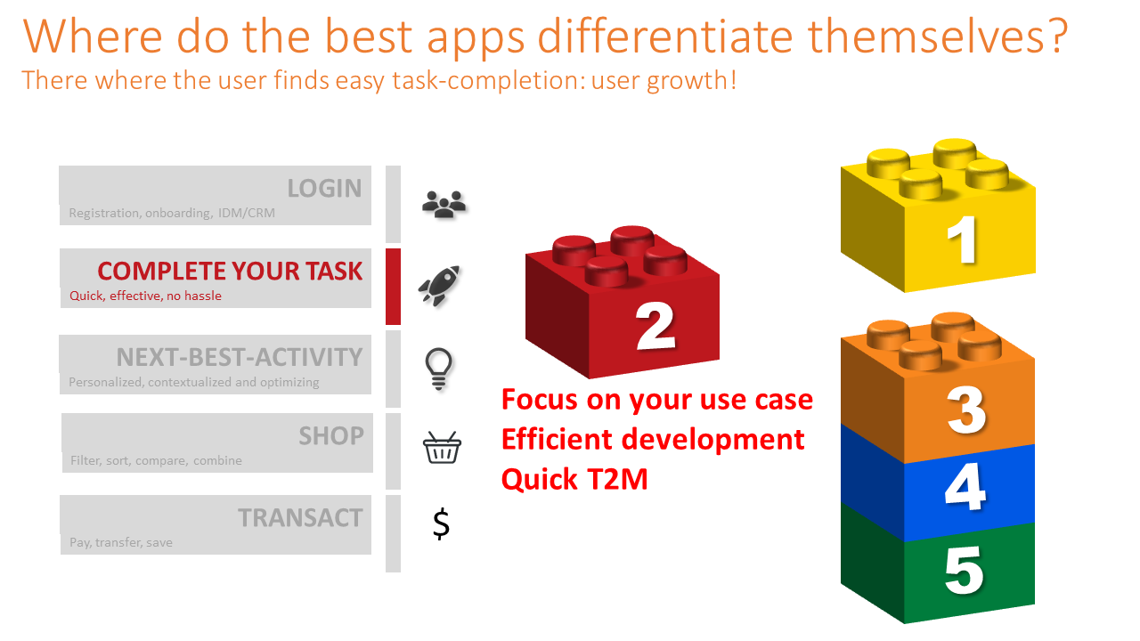
- Login: Identification management (IDM/CRM)
- registration
- login
- profile management
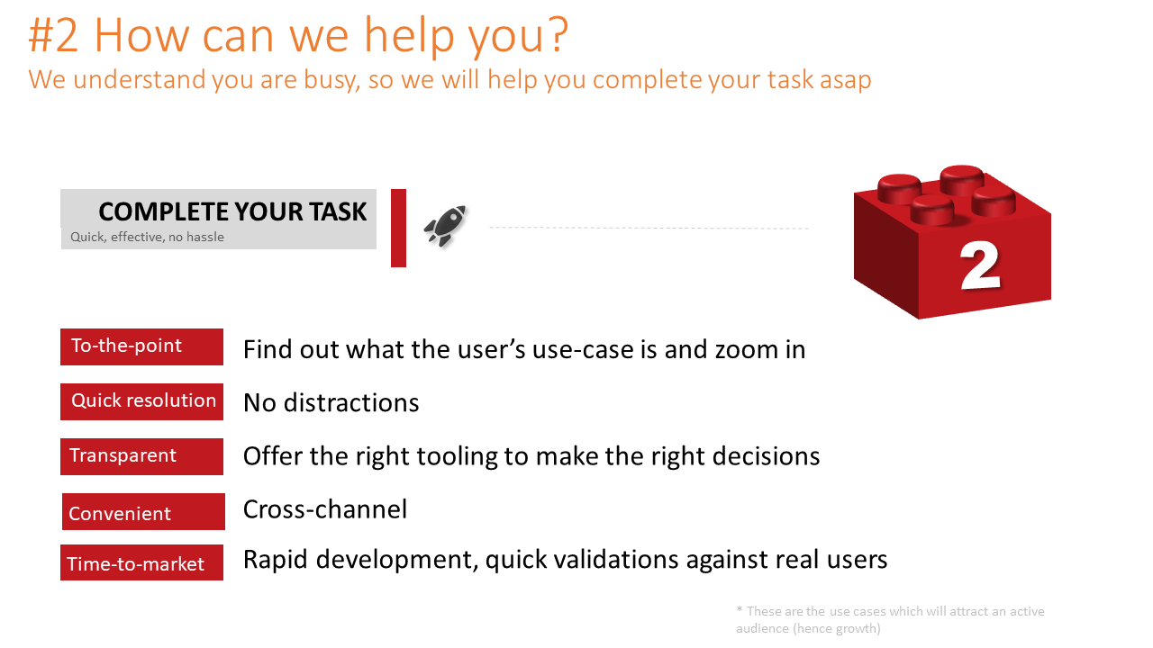
- Complete your task
This is where the user satisfies the task he/she set out on. This could be anything that the app or page is designed to cater for. Be it navigation, browse content, eCommerce or control a device. - Next-Best-Activity
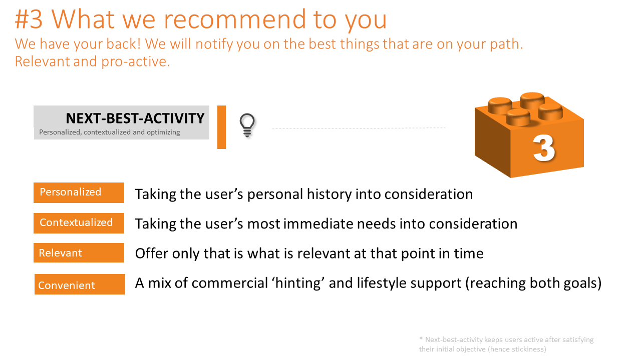
This is where the app entices the user to engage more. This could be via cross- and upselling, serving relevant content or suggest to try out new features of the app. These recommendations can be highly personalized and contextualized depending on the use case. - Shop
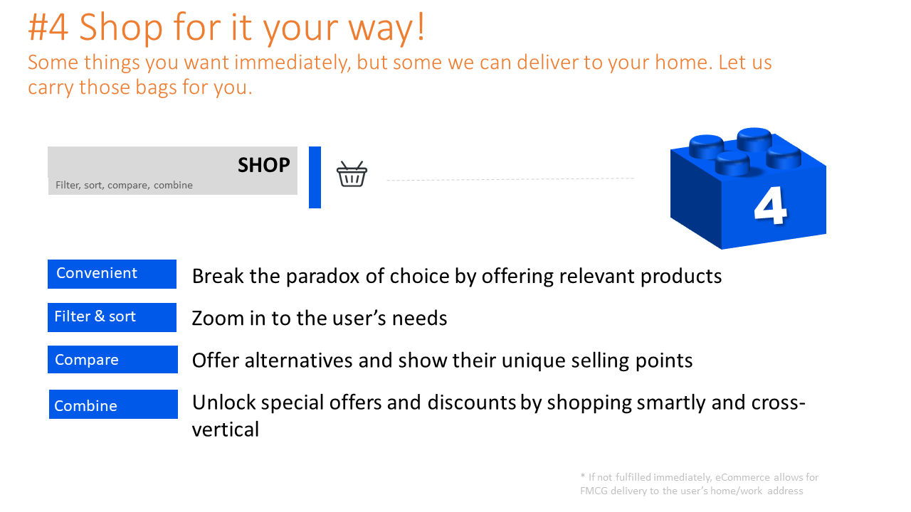
Many apps offer in-app purchasing, be it digital or physical consumer goods. This capability shows what’s on offer from a product catalogue and allows the user to add goods to a shopping basket. - Transact
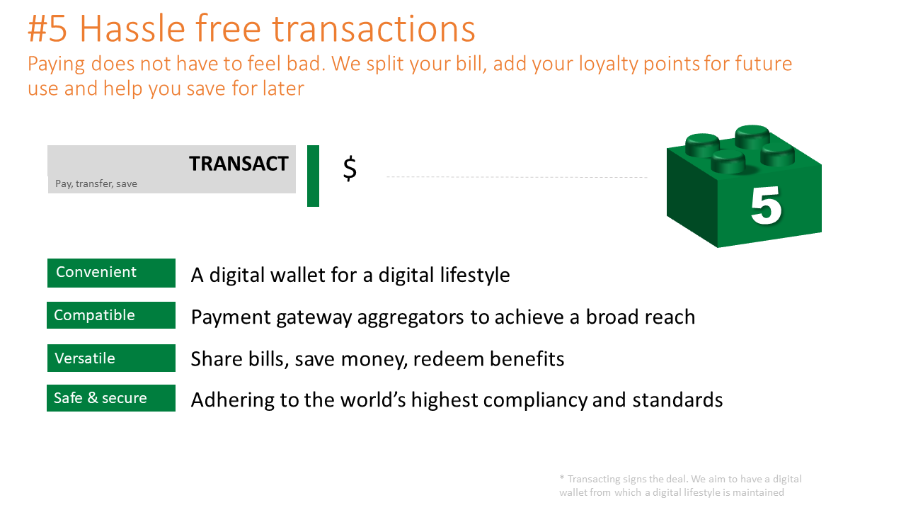
The final module is a so called ‘Point Of Sale’ (POS) where the application can process a transaction via credit cards, online banking or even digital currencies.Note: After a successful transaction loyal customers are rewarded with extra perks and benefits on their future visits. These will manifest themselves on their next ‘login’ on their IDM profile page.
Introducing adjacent product verticals
As your business expands and you introduce new verticals (like the bank introducing insurance), we can easily rebuild most of the new journey with existing building blocks. Likely only the ‘complete your task’ block will need to be built to cater for a new product journey.
This implies that the re-used blocks might need to evolve in concert with extra requirements, but would not grow out-of-sync with a number of functional ‘twins’ in other verticals.
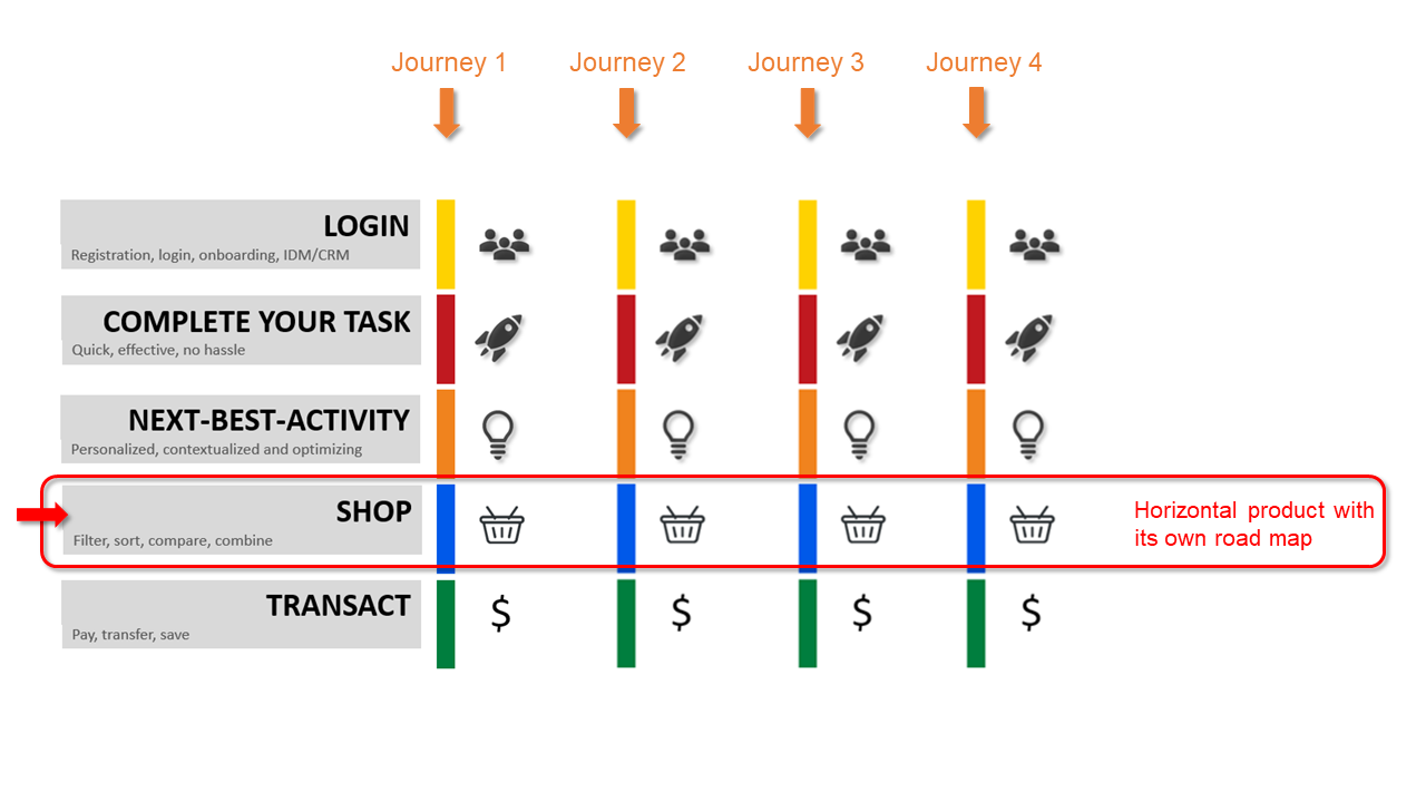
In the image below this is visualized. The individual journeys verticals are built from top to bottom by stacking their relevant ‘Lego blocks’.
However, the blocks themselves are developed on their own roadmaps by taking in requirements from the journey owners.
 This has the following benefits:
- All journeys share the same building blocks and offer a consistent UX.
- New verticals can be built fast. In less 20% of its traditional time-to-market (namely by focusing on its unique ‘task’ building block).
- Each functional block matures to meet industry best-practice to remain cutting edge in user experience and usability.
- Data capture and serving is done effectively across all steps of the journey and between apps, governed by a shared data model.
