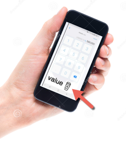
The world of cryptocurrencies is surely stirring up some debate in its young life. Blockchains that challenge traditional institutions, Bitcoin as a store of value, Ethereum offering smart contracts and coin offerings (ICO) to raise funding for projects. The list goes on with audacious plans and some tangible innovations. Will it revolutionise our banks, challenge the entire financial system or even redefine the internet as we know it today, or will is wither away as new technologies rise and overtake today’s excitement?
There are many challenges to overcome. Some technological, some philosophical and some political. One challenge I’d like to explore here is the user experience of cryptocurrencies, and a specific UX problem that is tied to the novelty of the the ‘digital gold’ it is claimed to be.
I don’t want to argue the purpose, need or even viability of digital currencies right now. If we want to explore its opportunities and limitations we need to expose it to wide variety of people and use cases. Today’s community of active users is relatively small. Somewhere between one and two million according to most guesstimates. Of those that actively work with cryptocurrencies, only a fraction uses it on a frequent basis other than a store-of-value. Using currencies like bitcoin as a practical method of payment is quite rare. Most likely we are talking ‘thousands’ of those that experiment by either transfer currency between each other or actually pay for goods like the anecdotal pizza or your groceries, be it via an intermediary. That is just a handful compared to its potential and some of its ‘rival’ ecosystems, like cash, visa or paypal.
To allow for more guerilla testing of this new technology at a safe level of risk (a pizza) today’s UX needs to improve. Fact is that today’s users are geeks, early adopters at best. They take a keen interest in trying it out between friends or at one of the scarce locations where goods or services are offered for bitcoin over a counter.
It is not a swipe-and-run type of experience. The ‘wallet’ like Bread (a key chain that allows the user to transfer ownership of their bitcoins) needs to synchronize first. This might take a while if not used frequently, but that would not be an issue if it became more mainstream. Next is to either send or receive an amount of bitcoin. This is where the user’s dedicated focus is required. In fairness, user interfaces do not come any simpler than Bread’s, but the anxiety is still high due to the sheer number of zeros between the price of a cup of coffee and the decimal point in an amount of bitcoin. We simply lack the emotional connotation to any amount of bitcoin, or ‘sathoshi’ (its smallest denomination). ‘A dollar’ represents a associated value, one that is still missing from the cryptocurrencies as we speak. It took the euro over a decade to settle into people’s minds, namely for those who dealt with national currencies for most of their life.
At the time of writing a $4 Starbucks coffee is 0.00092 bitcoin, and a 0 more or less is an easy mistake to make. The app does offer a clear ‘dollar amount’, but the idea that payments are definitive would make a decimal mistake a costly affair, especially when dealing with anyone else than a trusted friend who would kindly correct your donation with a swift refund (before the volatility of the bitcoin value tests the friend’s congenial loyalty 🙂 ).
The UX of Bread, and many similar wallets, is still a bit techy. In other words; it works, but it could be more empathetic to the user’s anxiety around spending the value of a cup of coffee or a months hard earned salary. It begs for some reassurance in the form of a configurable limit, or a visual clue on what 0.00092 bitcoin represents. The latter might be worth testing with a small group of users which is fortunate enough to have a Starbucks with bitcoin-benevolence nearby.
| $1 – $10 | |
| $10 – $100 | |
| $100 – $1.000 | |
 |
$1.000 – $10.000 |
 |
$10.000 – $100.000 |
 |
+ $100.000 |
